Game Design
Designing Game UI That Supports the Player’s Attention
Create readable HUDs and menus with clear hierarchy, input behavior, and accessibility built in.
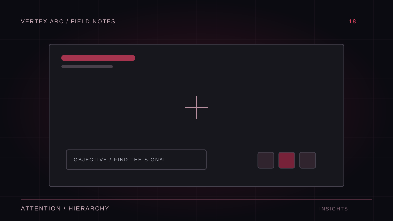
A game interface should answer the player's current question with as little interruption as possible. During combat, that question may be whether an ability is ready. In a menu, it may be what a setting changes. The same density and presentation rarely work equally well in both contexts.
Start by listing decisions, not widgets. Identify what information the player needs before acting, what confirms the result, and what can wait until later. This makes it easier to remove interface elements that occupy space without supporting a meaningful choice.
Build a clear information hierarchy
Prioritize essential status and immediate threats. Secondary goals and optional detail can use quieter treatment or appear when relevant. Avoid making every notification the same size and intensity. If a cosmetic unlock competes with a critical warning, the interface has lost its hierarchy.
Use position consistently. Players learn where to look for repeated information, and unnecessary movement makes that learning harder. Temporary effects can draw attention, but the underlying information should remain stable and readable after the animation ends.
Make text and symbols dependable
Test text at the smallest supported display size and expected viewing distance. High-resolution screenshots can conceal labels that are too small in actual play. Plan for localization: longer strings, different writing systems, and line wrapping can change the layout substantially.
Color should reinforce meaning rather than carry it alone. Pair it with shape, text, position, or an icon when the information is important. Test against different gameplay backgrounds, especially if the interface is translucent. A label that reads over a dark room may disappear over a bright effect.
Design navigation for every input method
Keyboard and controller navigation need an obvious focus state and predictable movement between controls. Test opening, closing, and returning from submenus. Focus should return somewhere useful rather than becoming lost or hidden behind a modal.
Respect touch and screen boundaries
Touch interfaces need comfortable targets and enough spacing to avoid accidental actions. Check safe areas, narrow screens, and orientation changes. Put frequent actions where they can be reached without obscuring essential gameplay, and verify with real interaction rather than only a static mockup.
Explain consequences at the right moment
Settings should have understandable labels and useful previews where possible. Destructive or irreversible actions need clear wording about the actual consequence. Routine actions should remain efficient. The purpose is to help the player decide, not to add confirmation dialogs to every interaction.
Loading, saving, and network operations also need honest states. Show when an action is pending and how failure can be recovered. Disable duplicate submission only when appropriate, and do not leave a control permanently inactive after a failed request.
- Navigate every menu without a mouse.
- Test long labels and increased text sizes.
- Check focus after closing dialogs.
- Verify readability over bright and dark gameplay.
- Confirm that feedback remains understandable with reduced motion.
Evaluate the interface during play
Watch where players look when they need information. If they repeatedly miss an element, investigate timing, placement, and competing signals before simply making it larger. An interface can be visually minimal yet cognitively demanding if it hides the relationships players need.
Good UI protects attention. It presents the right information at the right time, behaves consistently across inputs, and gives players confidence about what will happen next. That clarity is what lets the interface become part of the game rather than a separate obstacle around it.